Great news for call admins and review chairs: The Tracker has a new look! 🎉
Here’s a sample of how the new Overview page looks:

The new design is meant primarily to make the Tracker more mobile friendly and to make navigating a bit more user friendly. If the new design goes over well, the plan is to apply it gradually to the other call-admin areas (Settings and Tools). A few highlights:
- The new design is more “responsive”, meaning it works well on virtually any screen, from smartphones all the way up to giant desktop monitors.
- The navigation, which was previously across the top of the page, is now on the left-hand side of the page—at least on larger screens. On smaller screens it collapses down to a “hamburger menu”.
- Page headers now include the call’s logo for better branding. (Especially useful for review chairs.)
- The page tips have been rewritten to be clearer based on the user role (as a review chair or admin).
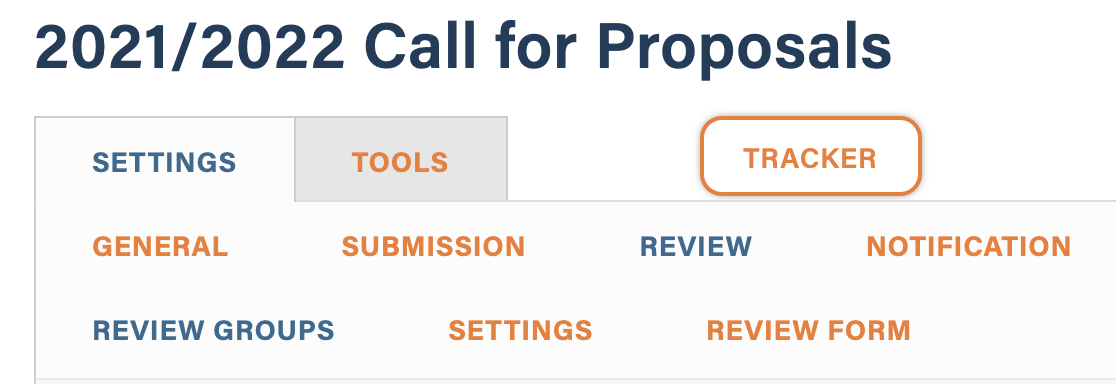
 You’ll also notice that the Tracker tab in the old-style call navigation has been separated from the rest of the navigation visually. (See screenshot to the right.) This is in preparation for migrating other sections of the call-management area over to the new layout.
I know change can often be unsettling, at least initially, but I really think the new layout will make the Tracker easier to use for everyone. If you’ve got any feedback I’d love to hear it!
