We’re improving the layout of the review page to make it easier than ever to review proposals in ProposalSpace!
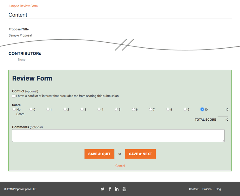
Starting Wednesday, July 11, reviewers will no longer see each proposal’s contents displayed in tandem with the review form. Instead, the two will be side-by-side. In case you’re wondering what that looks like, here’s a comparison of the old and new layouts. (Click on a layout for a larger view.)
| Old Layout: | New Layout: |
|---|---|
 |
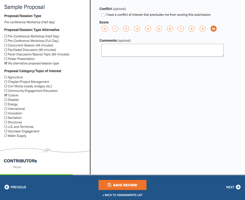 |
And here’s a larger view of the new layout with details about specific improvements:
1234567
- The panels are independently scrollable, so you can navigate to specific areas of the proposal or the review form without one affecting the other.
- The panels are resizable. Just slide the divider between them to the left or right.
- We’ve removed the “No answer” option for scoring questions. Now, clicking a score once selects it and clicking it again de-selects it.
- If the review form has more than one scoring question, each question’s score is displayed to the right and the total score is displayed at the end of the scoring section. (Not shown in this screenshot.)
- The Save Review button becomes active only after you’ve made a change to the review form. (If you try to leave the page without saving your review, the system will prompt you to save your work.)
- Navigation buttons at the bottom of the page allow you to move to the previous or next proposal in your list of assignments, or to return to your list of assignments.
- An indicator across the top of the control bar helps you keep track of your overall progress.
We hope the new layout and functionality will make it even easier for reviewers to complete their work. If you have any suggestions for improvement, please don’t hesitate to contact us or leave a comment below!