Some of you may have noticed a different look to our public pages (and slight changes to some of the pages on the back end of the site). That’s because we’ve had work

 The new design is meant to make the site’s public pages more attractive and mobile friendly. We’ve already incorporated some of the new design elements into the back end, but that process is a lot more involved and will take more time than the changes to the front end, so we’ll be releasing those more gradually.
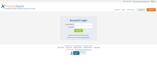
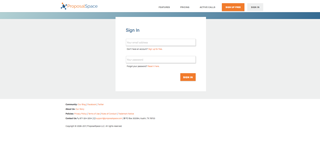
We also made some minor improvements to functionality, but overall everything should work exactly like it did before… it just looks a little better. For example, check out the old version of the login page (top) compared to the new version (bottom).
Of course, if you come across anything that looks out of place or doesn’t work like it did before, please let us know and we’ll fix it ASAP.
